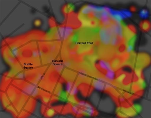
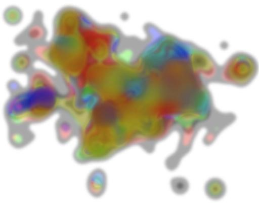
Cartograms are usually pretty mundane, but throw in Flickr, Photoshop, and a well-known public place and you have an artistic representation of popular colors. Much more eye-grabbing than your common map.
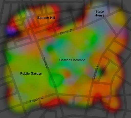
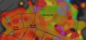
The colors represent what people on the ground are looking at in the specific physical-cultural landscape. Based off the most recent 2,000 Flickr geotagged photos, Cartogrammar found the average color in each photo, plotted it on the map, and interpolated them into a vivid diagrammatic rendering of our most favorite colors in that area.
The following photos show the process of color coding Boston Common:
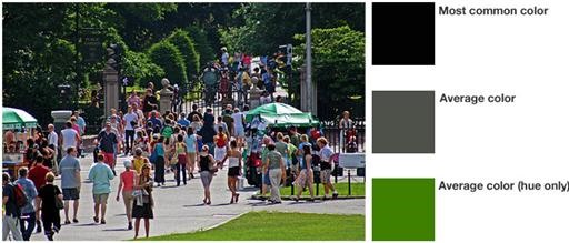
Determining the average color:
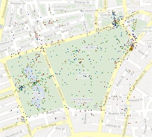
Plotting the colors where the photo was taken:
Interpolating (blurring) the colors via Photoshop:
Just updated your iPhone? You'll find new emoji, enhanced security, podcast transcripts, Apple Cash virtual numbers, and other useful features. There are even new additions hidden within Safari. Find out what's new and changed on your iPhone with the iOS 17.4 update.














Be the First to Comment
Share Your Thoughts